A Guide to Correctly Drawing Support and Resistance Levels Accurately
 Nearly every single technical based trading system will rely on you – the professional Forex trader, having the ability to correctly draw support and resistance levels on your price charts.
Mapping out your levels is going to be the most important core skill for any serious trader. If you have trouble marking your S/R levels accurately, then your trading as a whole may implode… violently.
What is built on a weak foundation will eventually crumble
Everyone is going to have a slightly different approach to getting their charts marked out, but it is the end result which counts.
I’ve seen some Forex sites posting up their opinions of support and resistance levels so you can just check in from time to time, clone those horizontal price levels on to your chart, and not have to think about the process at all. This is not the right way to go about becoming a legitimate trader.
Marking support and resistance is Forex 101 – once you learn the easy process of marking out price levels, you won’t need anyone to supply you theirs. Think about it in this way; It’s really like cheating on a test – you could be copying the wrong answers, you don’t learn anything, and won’t grow as a trader.
If you’re reading this, then you probably don’t want ‘a free lunch’ and have the thirst for knowledge with a goal to improve your own chart reading skills. Build good habits early and they will stick with you forever.
I am sure you want to be able to independently, and confidently read a price chart – if you’re just piggy backing off of someone else’s opinions, you will never truly get there. So today, I am going to show you the processes I user to mark out support and resistance.
You don’t need any fancy tools – just your own eyes to scan the price charts. It will be a major determining factor in how successful you are as a trader!
In this tutorial, I am going to cut through the confusion, and introduce you to the powerful basics of marking support and resistance.
STOP MAKING SUPPORT & RESISTANCE A COMPLEX TASK
I see all these charts getting posted around on forums, and they look like a child’s finger painting drawing, or the NASA control panel for space missions.
This is an epidemic with traders and it is really screwing with their ability to ‘read’ a price chart. Most truly believe that being complicated gives them a competitive edge over their fellow market participants.
Sound familiar?
With this sort of mentality, traders are really driven to go overboard in the hope they cover every technical basic possible, and make sure nothing ‘slips under the radar’.
In order to gain any traction with trading, I truly believe the best place to start is with a clean price chart with some crucial levels marked out, and that’s it. Once you can read a chart using price action and S/R levels, your trading will improve no matter what other strategy you decide to use.
Have a look at the chart example below – it’s a classic example of a Forex trader who takes things a little too far!
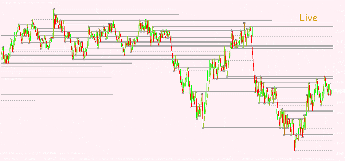
This Forex trader has created an environment that is not practical, and just too difficult to work with.
There is absolutely no need to over analyze like this – it’s extreme overkill. If your chart looks anything like this – you can fix this right now as a positive step towards better trading.
If you are working with a Forex chart polluted with meaningless horizontal levels, and other unnecessary variables like: trend lines, channels, or even a stack of indicators – making a confident trading call is going to be extremely frustrating.
A badly laid out chart is poison to your trading mind-set. It’s very hard to make logical, rational decisions from confusing data. You endanger yourself to falling prey to your emotions.
The idea is to be minimalistic with the charts and the markets.
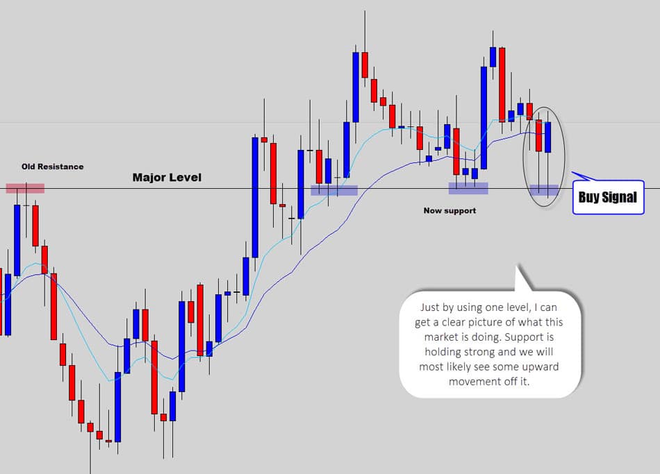
In fact, you only need to mark out the significant levels that are surrounding the current price movements at the given time. In some cases we will only have 1 line marked on our charts – as you may have noticed in our Forex market commentary.
You will find in most situations it only takes that ‘one well marked level’ to clearly map out, and help you clearly ‘read the situation’ on a price chart.
Seriously, anything over 3 lines marked on the chart would start to be considered too ‘busy’ and need some cleaning up.
By only marking out the important levels to watch you will keep your charts tidy, simple, and easy to read. This gives clarity back to the chart and to the trader – allowing the identification of good trade setups, and making the anticipation of future price movements much easier.
SUMMARY
Traders kill their trading at the very core by making a mess of their charts. There is no need to have too much going on, prioritize your support and resistance levels so only the really important ones are marked. This will help keep your chart clean – by doing this you eliminate self-sabotaging confusion and promote high precision trading.
UNDERSTANDING SUPPORT AND RESISTANCE
Support and resistance levels are proven price areas where buyers and sellers find some form of equilibrium. We generally see a shift in the balance of power between buyers and sellers occur at these levels – this ‘power shift’ generates the classic price reversal patterns we are always on the look out for.
Therefore true support and resistance levels are the major turning points in the market.
Price doesn’t move in straight lines as you are most likely aware of – instead we see price swinging up and down, creating new swing lows, swing highs, or re-testing existing ones.
The more often price does this ‘stop and reverse’ action at a specific level – the ‘stronger’ or more’ significant’ that particular S/R level becomes.
Price is communicating to you that “this price level is being defended aggressively”, and could be a good area to look for reversal signals.
It’s also worth noting that support and resistance levels that are clearly visible on the higher time frames are considered to be greater in value, and have an increased chance of becoming a price turning point.
Just remember; the higher the time frame, the more significant the S/R becomes.
When we draw our S/R levels – we work on the daily time frame the majority of the time.
I recommend using weekly and monthly charts to mark out the more significant or ‘major’ levels in play. These weekly and monthly levels are really good areas to watch out for strong candlestick reversal patterns, like the rejection candle reversal – especially if you’re going counter trend.
Intra-day levels are generally not worth worrying about, price cuts through these like a hot knife through butter on a day-to-day basis and don’t offer much technical value.
This is one of the reasons intra-day or ‘day trading’ is much more difficult and has a very low success rate. You’re definitely trading on a shaky foundation when you ‘hone in’, or tune your analysis on those lower time frames – it’s not worth it.
SUMMARY
Support and resistance are horizontal levels the market has used in the past as a turning point on the chart. They can be found on all time frames, but are best sourced from higher time frame charts, such as the daily and weekly. The higher you go up the time frames, the more data inside the candles – therefore the more significant the levels become, and are more likely to act as a turning point in the future.
WORKING WITH SUPPORT & RESISTANCE IN RANGE-BOUND MARKETS
Lets get a little bit more practical and move into some technical demonstrations.
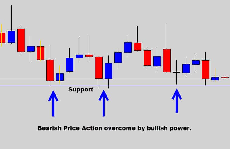
Support is an area on the chart where the market demonstrates strong buying action, easily identifiable by price ‘bottoming out’ caused by bearish price action movement being overrun by bullish pressure at a consistent price horizontal level on the charts.
Support is often referred to as the ‘floor’ that price bounces off, or has trouble moving past to the downside.
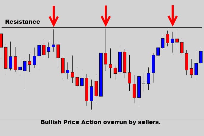
Resistance is the opposite of support – it’s where you see price ‘topping out’ as the bullish price action movement is consumed by bearish activity at consistent price levels on the charts.
Resistance is known as the price ‘ceiling’ that the market tends to fall off, or has difficulty pushing through to the upside.
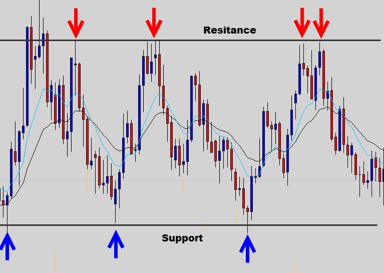
Support and resistance is fairly simple to understand when you look at ranging markets – they make up the major containment lines of range-bound systems.
When a market is range-bound, the only levels you really need to have marked out are the upper resistance ‘ceiling’, and the lower support ‘floor’ of the range.
We recommend to only trade buy or sell signals from these main upper and lower boundaries. Short signals are valid at range resistance, and long signals are to be targeted at the range support.
SUMMARY
Ranging markets are really easy to ‘map out’ on your charts. You need to draw your levels so that you highlight the upper resistance and lower support containment levels. These are the major turning points for a range and deserve your attention. The best trading opportunities will form here. Stay away from the middle of the range, it’s a ‘no fly zone’ that spawns a lot of bad signals and rough price action.
TRENDING MARKETS
Trending markets are identified by using swing patterns that are broken down into classic sequences higher highs, higher lows, lower highs and lower lows (not in that order).
These key technical high and low points are called ‘swing highs’ and ‘swing lows’, and it is the order which they appear on the chart is vital to identifying trends, especially if you want to catch them in their early stages of development.
During a bullish trend, price will step upwards in a zig-zag type pattern – almost like price is walking up a flight of stairs. Price will gradually step its way higher forming that ‘staircase footprint’ on the chart.
Higher highs (or swing highs) in bullish trends is where the market finds resistance, and generally starts off a correctional move.
Higher lows (or swing lows) normally are formed after a counter trend correction is terminated, and the market finds its footing (support). Trend momentum kicks back in here and generally pushes price into the next higher high to complete the next phase of the trend.
During a downward bearish trend, the opposite is true.
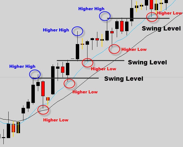
Notice the ‘staircase’ upward motion – price is finding support and resistance at the swing highs & swing lows, as it moves in the general upward direction.
In trending markets, the critical levels that we recommend to mark, and watch are the ‘Swing levels’ – which is one of the main principles of swing trading.
Swing levels are ‘hot zones’ for price reversals and trend continuation – so they want to have your full attention.
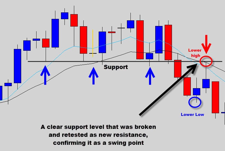
They form when old resistance turns into new support, or vice versa. Basically, the level reverses it’s role from old support to new resistance, or from old resistance to new support. A very important technical event on the chart.
Or if I put it another way – swing levels are when a swing high acts as a new swing low, or an old swing low is used as a new swing high. Study the chart above and you will see each swing level lines up swing highs and lows on the horizontal plane.
Price Action signals that generate off swing levels during trends have a high success rate, that’s why I call them the ‘hot spots’.
There are two main reasons for this; Firstly, there is already trend momentum backing the trade, secondly a swing level – which we know is a key turning point in the trend, adds to the chances that the trade will move in your favor.
Here is an example of a bearish trend and its related swing levels.
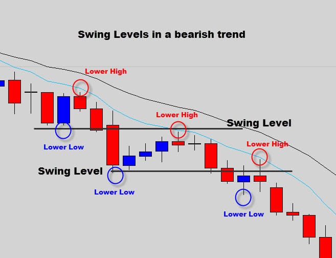
In this downtrend we have marked out the swing levels (where old support levels have turned into new resistance).
See how in a bearish trend, the staircase footprint price travels through is inverted to the bullish trend – just think of someone walking down the stairs this time.
SUMMARY
Trending markets rarely move in a straight line – instead they ‘walk’ up, or down the chart leaving a ‘staircase looking footprint’ as price swings from highs and lows, but still moving in an overall dominant direction. During trending markets it’s the swing levels that are most important to have mapped out on your chart, because they are the critical turning points in a trending environment, which I call the hot spots of a trend.
THE WEEKLY AND MONTHLY LEVELS
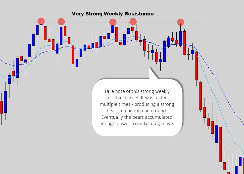
On a larger scale, strong weekly and monthly support and resistance levels should be marked on your chart when the current price is the vicinity, or approaching those levels.
These weekly price levels that are dominant from these higher timescales are majorturning points in the market, and want to be paid close attention to.
Strong daily price action signals that occur at significant weekly or monthly S/R can be the catalyst for a strong reversal move – and create very profitable trades if you have the discipline to hold a trade open for a longer duration.
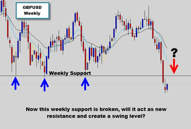
In the GBPUSD chart above – you can see how this support level was acting as strong weekly support, and had been a key turning point in this market.
Now because price has broken through this important level – the best course of action is to wait and see if the market will now respect this old weekly support as new resistance.
We can confirm this if a bearish price action reversal signal forms when price retests the old support. It’s all about letting the price action tell you where it wants to go.
Don’t assume something is going to play out the way you think, and take action too early – the market will teach you a harsh lesson for doing that.
In the examples above, we’ve identified the key support and resistance levels on the chart without cluttering up the template with any indicators, trend lines or other chart tools.
Only mark out the important levels that market is currently reacting with at the present time. I don’t think the market cares too much about levels from 10 years ago.
Just concentrate what’s going on in the ‘now’, because support and resistance levels do change over time.
Remember – the market is not static, it’s a dynamic environment. Support, resistance & swing levels will change as the market dynamics change.
By sticking with the levels the current market is respecting, you can keep your hand on the ‘market pulse’, tuning you in to current conditions. Do this and logical, confident trading decisions will flow much easier, so long as you are basing your decisions on what a simple price chart template is communicating to you.
SUMMARY
Weekly levels are major reversal points in the market. Watch for any approaching weekly, or monthly support or resistance and mark them on your chart, so you can pay special attention to them and watch for any strong reversal signals. Very lucrative trading opportunities can develop from these levels if you’re willing to hold your trade.
TAKE HOME NOTES
A few points to remember from today’s tutorial…
- Mark upper resistance and lower support in range bound markets
- When price breaks a support or resistance level – mark it on your chart and wait for a signal to confirm it as a new swing level
- During trending conditions – mark higher highs and lower lows and wait for them to be confirmed as a swing level via a price action signal or a price bounce.
- Mark the support and resistance levels on your chart that are dominant on the weekly and monthly chart, but only around the area where current price is located (no need to go back years and years ago).
- Remember the higher the time frame, the higher the significance, the higher chances are of success.
I truly hope today’s guide to identifying support and resistance levels has given you some new insight on how to structure your charts, and plan your trades more effectively.
Don’t expect to nail it immediately just from one pass of this lesson. The ability to draw levels correctly is learned over time and with patience – so don’t give up.
If you’ve stuck with crowed price charts that are overloaded with a horde of support and resistance levels (and indicators to boot) – then you’re going about it the wrong way. Scrub your chart clean, start again and use the methods discussed here today to keep trading nice and simple.
Acquiring the skill of correctly marking out support and resistance is obviously very important for any Forex trader – but we’ve only scratched the surface here in today’s introduction.
HAPPY TRADING ......WISH YOU SUCCESS IN YOUR TRADING
No comments:
Post a Comment